

When the company was still taking shape in Boston, finding the right name became unexpectedly important. The vision already existed: build something around travel, movement, and human connection. But the name needed to carry more than functionality. It needed depth. Something timeless. Something that could grow.
At first, another name was considered: Safaar, derived from the Arabic word for travel or journey. It worked linguistically, but something felt incomplete.
Then came Raahi.
And immediately, it felt larger than travel itself.
Raahi means traveler — but not in the transactional sense. Not someone simply moving from one destination to another. A Raahi is a seeker. A wanderer. Someone shaped by the journey itself.
Across different languages and cultures, the meaning remained surprisingly consistent:
- In Sanskrit, Raahi means traveler, wayfarer, or one who journeys — often describing life itself as a path of movement and growth.
- In Hindi and Urdu, it refers to a traveler, wanderer, or seeker.
- In Arabic, its root associations connect to the idea of a path, direction, or the way one follows.
- In Persian traditions, related interpretations associate it with contentment and fulfillment.
Different civilizations, different histories, yet the same idea kept appearing: movement, exploration, direction, becoming.
That universality made the decision feel inevitable.
The app icon came later, during time spent in Goa.
Oddly enough, it did not begin with branding references or design trends. It began with an oil lamp.
At a temple in Trincomalee, Sri Lanka the sight of traditional oil lamps facing one another stayed in memory long after the moment passed. Eventually, that image evolved into the foundation of the symbol.
The final app icon was constructed using twelve golden-ratio circles. At first glance, many people see a flower. But it was never designed as one.
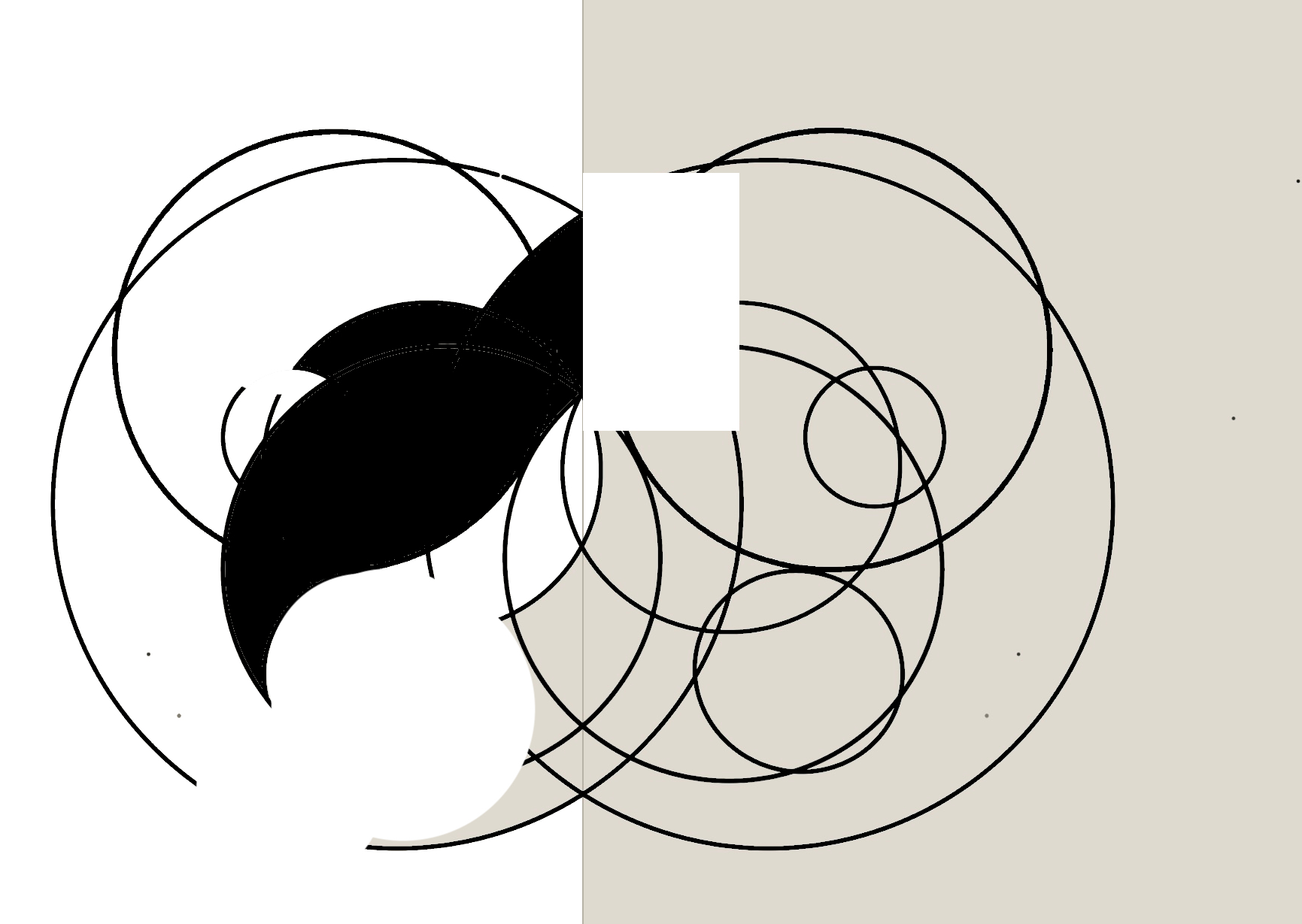
It is a path.
A traveler's movement through hills, valleys, curves, setbacks, and returns — individual turns eventually forming something whole. Hidden within the form is the silhouette of two oil lamps facing each other, with a single flame glowing at the center.
The symbol became two ideas at once: the journey, and the light that guides it.
Over time, the app icon began to represent something even broader. To some, it resembles biodiversity and interconnected systems in nature. To others, it feels spiritual. Some simply see movement.
That ambiguity was intentional.
Because Raahi was never meant to represent one culture, one geography, or one type of traveler. The name and app icon were designed to feel universal — familiar even when encountered for the first time.
In the end, the identity of Raahi came together the same way meaningful journeys often do:
not through force, but through recognition.
The feeling that you have arrived somewhere you were always meant to find.